Beantown Baby Diaper Bank
Heuristic UX evaluation using 118 nonprofit engagement criteria to improve donor trust, volunteer recruitment, and donation flows
Key Findings
Mission, 501(c)(3) status, and donation infrastructure already communicate reliability — the foundation to build on.
The site rarely shows what donations actually do for families, which weakens emotional connection and urgency.
Donating, volunteering, and learning more require extra clicks and hunting, instead of one clear, guided journey.
With the rubric, we could show exactly which changes would most improve donor trust, recruitment, and donations.
Overview
Beantown Baby is a diaper bank organization. As part of Bentley University’s Human Factors in Experience Design course (Fall 2025), I collaborated with a team of 20 researchers to conduct a heuristic evaluation of the organization’s website. The goal was to identify usability gaps and deliver actionable recommendations to improve transparency, engagement, and conversion for donors and volunteers.
My role
As a member of the research team, I contributed to designing and executing the evaluation using usability guidelines from the Nielsen Norman Group. I helped assess the site against criteria that matter for nonprofit engagement: donor trust, volunteer recruitment, and donation flows.
Scope & method
- Heuristic evaluation - Applied Nielsen Norman Group guidelines for nonprofit and charity websites to the Beantown Baby site.
- 118 UX and nonprofit engagement criteria - Started from 116 original guidelines, removed items that only applied to chapters/affiliates, and added new criteria for Instagram and social presence; evaluated donor trust, volunteer recruitment, and donation flows.
- Gap analysis - Identified usability gaps that could hinder transparency, engagement, and conversion.
- Scoring rubric - Scored each guideline as green (complies), yellow (somewhat complies), red (does not comply), or n/a (not applicable), then translated yellow/red items into concrete recommendations.
- Actionable recommendations - Developed strategic improvements to address the highest-impact yellow and red areas.
Executive summary
What is working well
- The organization name, Beantown Baby Diaper Bank, clearly communicates the purpose of the nonprofit.
- The website establishes credibility with a clear mission statement, visible 501(c)(3) status, and local media coverage.
- The donation button appears on every page and is very easy to find.
- The donation process is supported by trusted third-party payment providers.
- Brand colors are used consistently throughout the website.
Recommendations for improvement
- Strengthen emotional appeal and create a more authentic connection with supporters.
- Elevate the overall look and feel to increase trust and engagement.
- Add a native, integrated donation option to reduce friction.
- Incorporate language that clearly communicates the impact of giving.
- Provide clear, intuitive pathways for people to get involved.
Outcomes
Our team synthesized findings into clear, stakeholder-ready deliverables and presented the results and strategic improvements to Beantown Baby stakeholders, supporting the organization’s ability to build trust, recruit volunteers, and streamline donation flows.
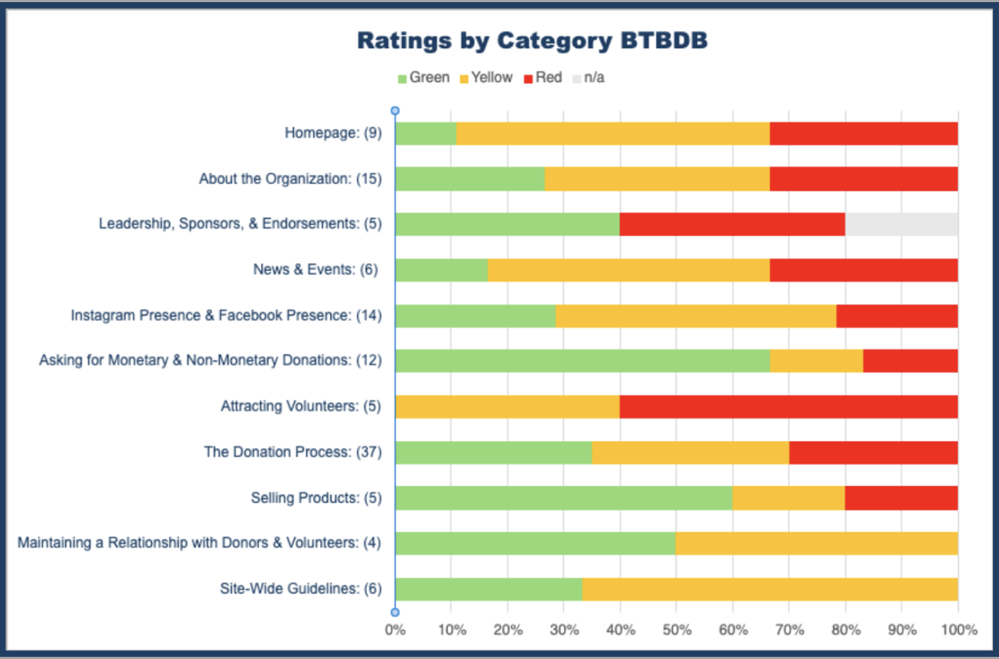
Annotated evaluation slides
To communicate our findings in a way that felt concrete and actionable, I helped build an evaluation deck that walked Beantown Baby through what was working, where donors might get stuck, and how to strengthen trust across the experience. Here are a few of the slides we used with stakeholders.


Skills & tools
Impact
Identified 47 high-priority UX issues across a 118-criteria evaluation framework. Findings were synthesized into a prioritized action roadmap covering critical wins for donors and volunteers, and presented to nonprofit stakeholders with clear next steps for implementation.
Interested in this work or want to go deeper? Connect on LinkedIn or send me an email — I'm happy to walk through the full study, share the paper, or just talk research.